
Logo & package redesign
Rooted Candle
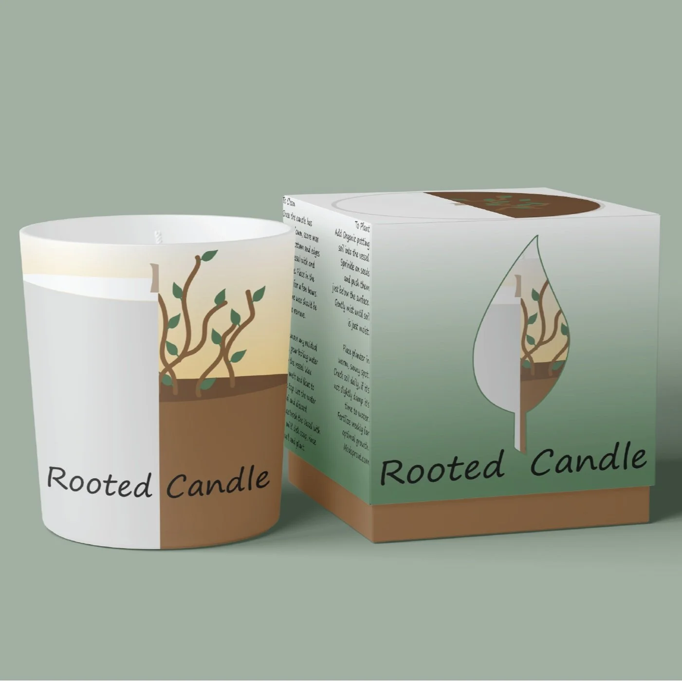
A redesign that elevates a fun, hopeful product. Free-flowing Segoe Print type gives the packaging a natural, plant-inspired look that pops off the shelf.
- Project type
- Redesign
- Purpose
- Product redesign
- Tools
- Adobe Illustrator, Photoshop
Design process
The challenge
Rooted Candle is a product with a hopeful message, so it needs to stand out. A redesign should always elevate and improve the product — and that was the goal here.
Type study
The aim was to keep the fun, unique spirit of the original while making it more appealing to shoppers. Segoe Print feels free-flowing and simple, giving the design a natural, plant-inspired look.
Where it started
The original packaging was a little bland. On a store shelf nothing made it pop, and its muted pastel palette blended in with the products around it.
- #7DB8A0
- #EFCBAC
- #6B3725
The redesign
The new packaging uses an earthy, summery, floral palette. In a plant or candle aisle, these colors catch the shopper's eye and make the product stand out from the rest.
- #557C58
- #8C6239
- #FCBE24
Final logo
The logo uses a look-through effect that hints at the candle inside, so shoppers can see the product before opening it without making the whole package see-through.