
Logo & shirt design
Allied Environmental
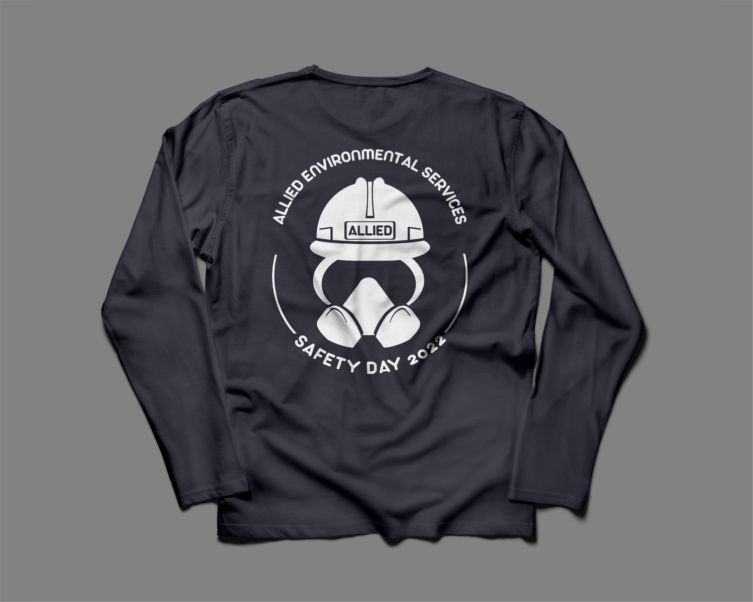
A bold, legible logo for an environmental company, designed to stand out on a simple shirt. Circular, smooth-lined type lets the graphic speak first.
- Project type
- Client
- Purpose
- Product ideation & design
- Tools
- Adobe Illustrator, Photoshop
Design process
The challenge
For an environmental company, eyes are always watching — so a strong logo matters. Standing out on a simple shirt is hard: the design has to be easy to read and still eye-catching. There were many rounds of changes, and in the end the client couldn't have been happier.
Type study
The client wanted the words to flow in a circle. Arista 2.0 Alternate, with its natural curves and smooth lines, stays subtle but still pops, so the graphic speaks first and the words follow.
Color palette
A simple palette keeps the illustration clear and gives the design an overall theme.
- #F2F2F2
- #A7A9AC
- #3B3B82
Logo ideas
The client asked specifically for a hard hat, mask, and goggles; the rest was up to me. I made 12 versions, trying different headings ("Safety First Rise To The Top" and "Allied Environmental Services Safety Day 2022"), rounder and more kernel-shaped masks, and masks with and without edge highlights.
Testing shirt colors
Since everyone would see this logo, the color had to pop. I showed the client their top four choices in several color combinations so they could see what worked best.
Final logo
The final logo brings together what the company wanted most: the most common respirator filter, the hard hat used in the field, and the safety goggles their workers wear every day.