Brand identity2024
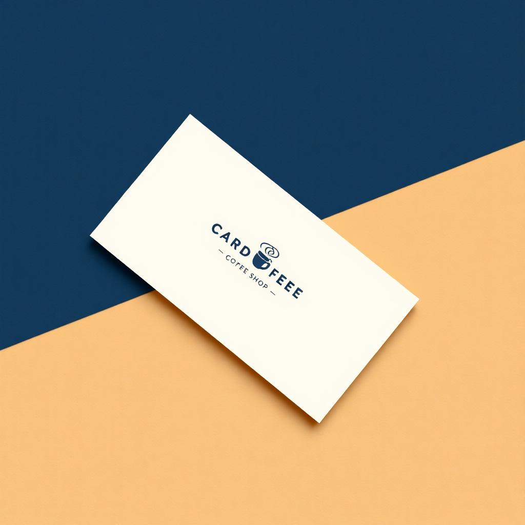
Cardfee Coffee
A neighborhood roaster needed a wordmark that felt warm but precise. We landed on a serif lockup with a tucked-in cup glyph, paired with a navy-and-cream system that runs from cups to signage.
Portfolio
A small, focused practice means each project gets real attention. Here are three I'm especially proud of.
A neighborhood roaster needed a wordmark that felt warm but precise. We landed on a serif lockup with a tucked-in cup glyph, paired with a navy-and-cream system that runs from cups to signage.
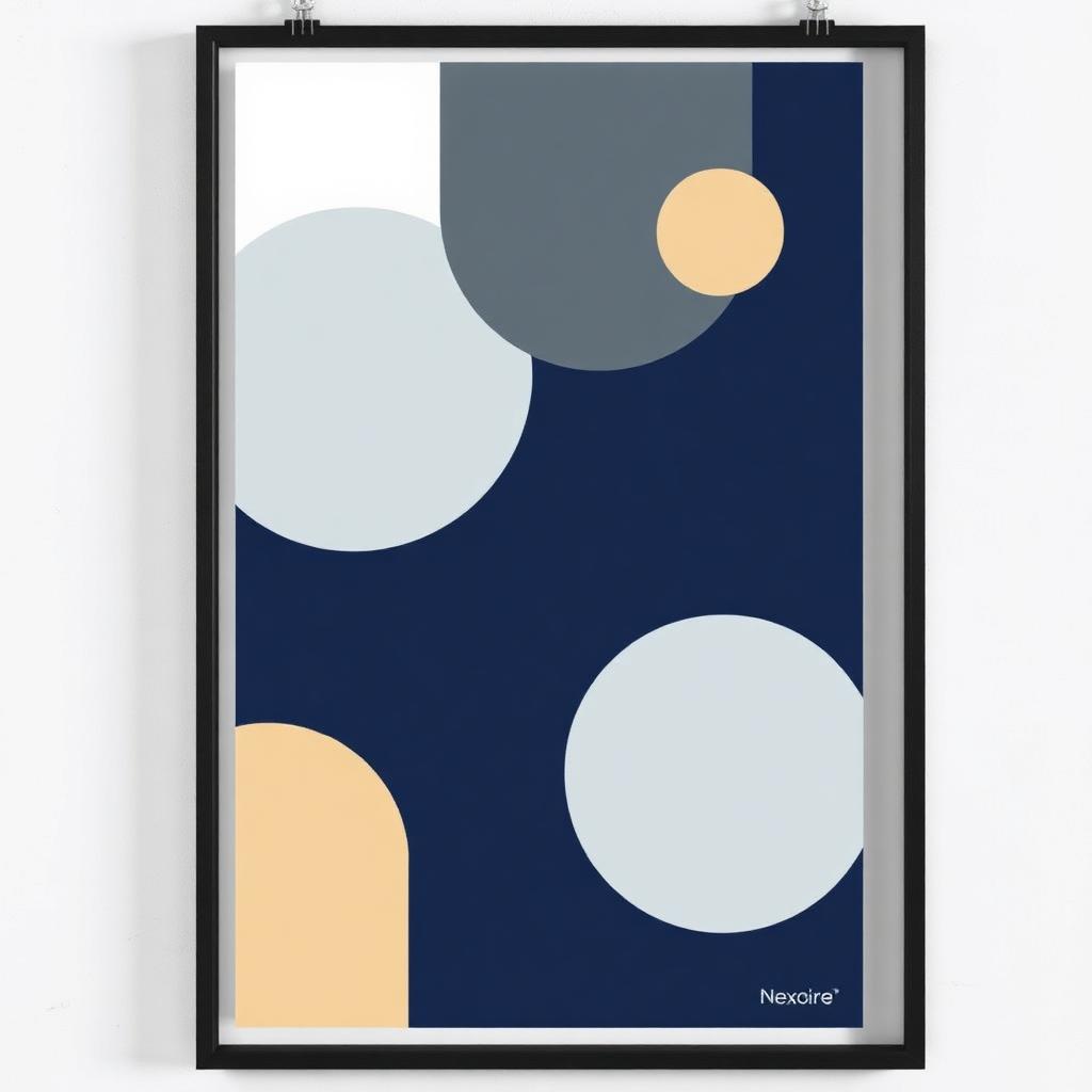
A three-poster campaign built around overlapping geometric forms — designed to read from across a room and reward a closer look.
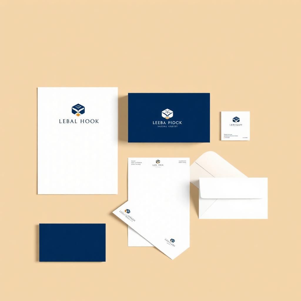
Identity and full stationery system for a boutique consultancy. The mark is a compact monogram that holds up at favicon size and looks confident on a letterhead.