
Branding & package design
Simply Beverage Co
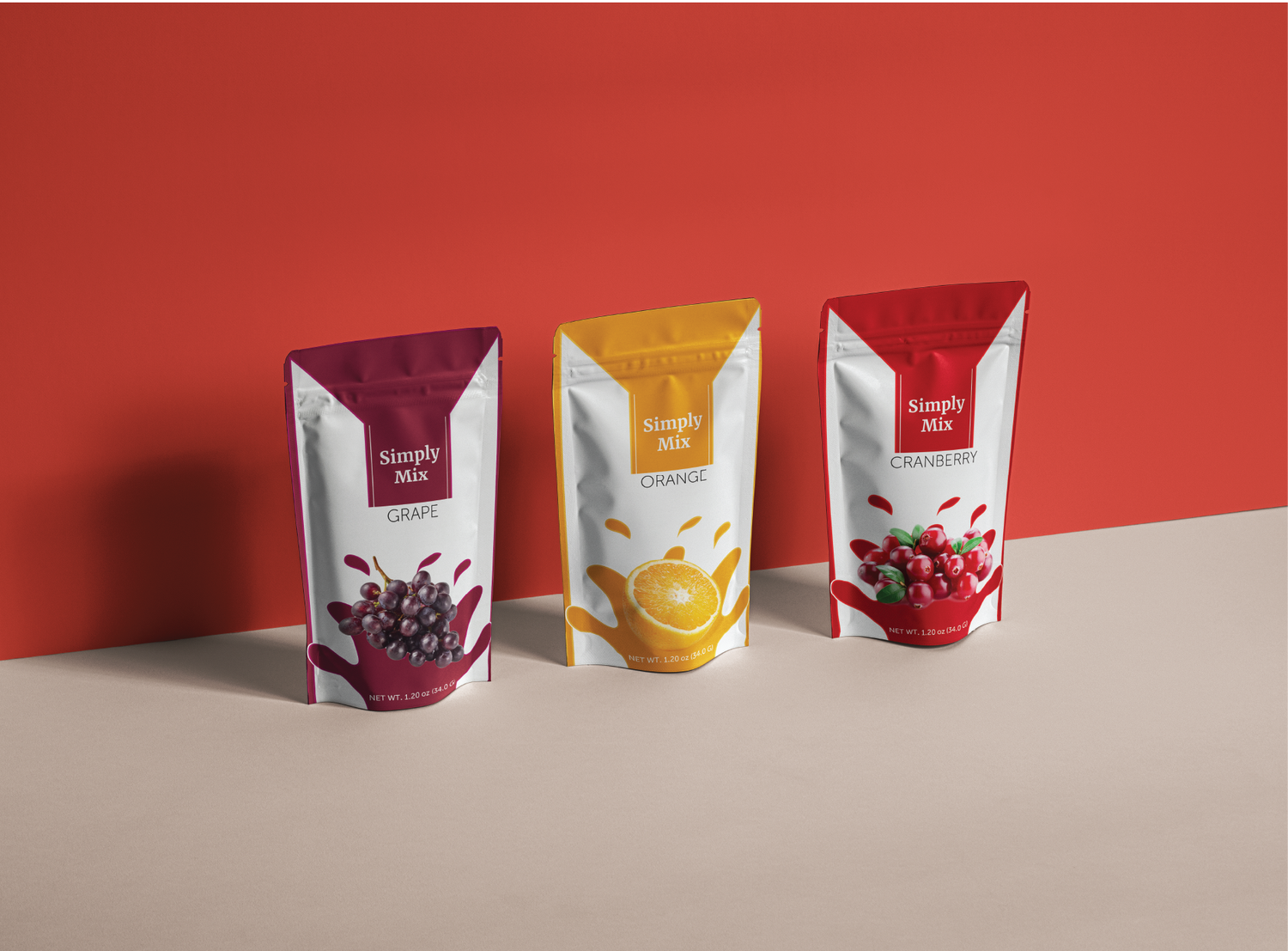
A drink-mix redesign that simplifies and elevates the brand. Merriweather adds legibility and boldness so the product stands out in the drink aisle.
- Project type
- Redesign
- Purpose
- Product redesign & ideas
- Tools
- Adobe Illustrator, Photoshop
Design process
The challenge
In the drink aisle there's a lot of competition. Standing out takes authenticity and an understanding of where a shopper's eye falls. A redesign has to elevate the brand while staying true to its story.
Type study
I wanted to simplify the brand while making it feel more polished. Merriweather is simple with a subtle flair — more legible than the original font while still bold.
Color palette
A rich, fruity palette keeps the design simple and gives the line a consistent theme.
- #7C2037
- #B20115
- #E6860B
Final logo
Each drink mix's logo uses the main color of its fruit flavor so the packages flow together. The slogan "Simply Mix" plays on the Simply Beverage name.